Digital Pulse UI Kit - Link Component
Company
CVS Health
Challenge
The Design Systems team was established to provide design libraries, components, and styles to help CVS Health efficiently deliver exceptional, seamless ominchannel experiences. We partner with accessibility, brand, marketing, engineering, product. and content strategy with input from designers across the digital organization. These partnerships help create a consistent, usable design system.
My Role
I serve as a player coach that equally leads a team of designers, and contributes to creating flexible, accessible and reusable UI components and usage documentation. Some notable successes include producing several web atomic components and patterns, facilitating usability testing to validate solutions, along with strategic design system adoption across digital teams, and process improvement initiatives. I also lead a strategic initiative for the adoption of the Pulse UI Kit within the digital org, where I partner with teams including Brand and Marketing, along with teams that focus on specific user journeys such as scheduling appointments within MinuteClinic.
Featured Component Work
- Published Figma component & documentation for Link
- Published system and messaging icons that contribute to Link enhancements
Project Discovery
As part of the Design Systems team, we work in an agile environment with a prioritized backlog. During the intake phase of the project, stakeholder interviews are held to review data insights, review of previous solutions, and to define key business objectives. Link is a high impact atomic level component necessary for navigation. The goal for this work is to design the link component, publish to the UI Kit available for teams in Figma, and create documentation for usage guidance.
Acceptance criteria is:
Internal research CVS link examples & use cases, review metrics data - heat maps, click through rates, etc
Competitive / heuristic / gap analysis
Workshops - alignment, assumption mapping, affinity diagram mapping, service blueprint, problem framing
Draft designs, pressure testing, iterative refinements, QA to fix any bugs or inconsistencies
Token and accessibility annotations for component
Draft requirements documentation with usage guidance, best practices, variant types, anatomy, spacing, formatting, content details, and behavior expectations
User testing to support direction, including users with disabilities
Team review for collaborative feedback, awareness, alignment, and to uncover and challenges or necessary enhancements
Definition of Done:
Published design component with token & accessibility annotations
Published icon set
Published documentation
Release demo presentation and communication distributed
Top goals for our users:
Navigate to different locations, such as webpages or external applications
Top Challenges our users face:
Inconsistent identification and behavior with patterns across experiences that may impact click and task completion rates
Defining Link
Link allows users to navigate to a new location, but not as a result of submitting information.

Use Cases
In general, use a link instead of a button when you:
Navigate to another page or website
Jump to a particular element on the current page
Direct links to phone numbers or email addresses
Open resources such as PDFs
Use links of their own or within sentences or paragraphs. Avoid using too many links on a page, it makes it difficult for users to identify next steps. This is especially true for inline links.
When not to use
Use buttons when you want users to:
Submit a form
Make a choice or selection on a page
Manipulate an element (such as opening a modal)
Move forward in a multi-step process
Proper implementation of buttons and links is important.
Types
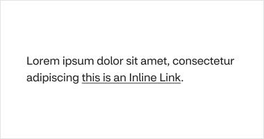
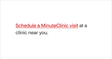
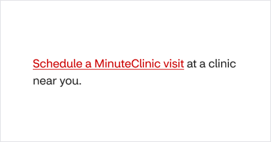
Inline
Use inline links within a sentence or paragraph. Inline links are always underlined to help show interactivity. The can include an icon. Inline link target size is inherited by the line-height of the paragraph it is within.
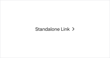
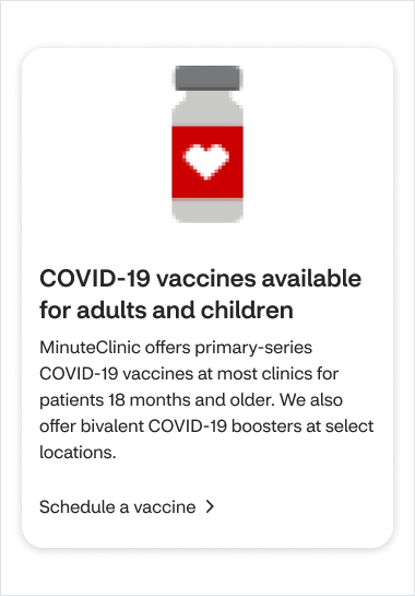
Standalone
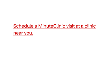
Standalone is used for important links and comes in two weights, regular and strong.
Always place standalone outside of a paragraph or sentence
Only pair standalone with text that does not have the same weight
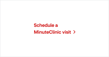
Standalone links must always have a right-facing angle small icon, following the text. In addition, an optional icon can be used before the text.

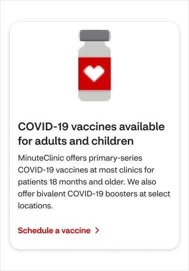
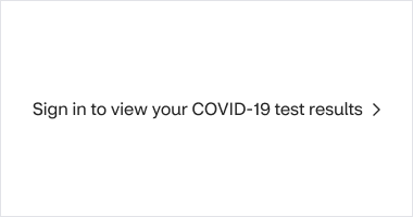
CTA
Use CTA link highlight promotional content on a page.
Always place it outside of a paragraph or sentence
Avoid using it more than once on a screen
For additional links that go to the same destination use standalone, standalone (strong) or inline
CTA link has a solid background color and is always paired with a right-facing angle small icon, following the text.
Themes

Standard
Standard links are the most common link theme style on a screen. Use them for actions that are moderately prominent. Standard links work well on light page backgrounds. If the standard link doesn’t provide 4:5:1+ color contrast with the page background, use the following sub-themes instead.

Reversed
Use reversed links when standard links don't meet color contrast requirements. Reversed links work well on dark backgrounds.

High-Contrast
Use high-contrast links when standard and reversed link types do not meet color contrast requirements.

Anatomy
Link text: communicates link destination
Angle small icon: communicates paired text is a link
Icon (optional): communicates a metaphor for the link destination

Spacing
Standalone, and CTA links have a minimum target size of 44px height and width.
Inline link target size is inherited by the line-height of the paragraph it is within. To ensure that inline links are selectable
Use only as necessary
Avoid placing several inline links close together
The link text can be understood out of context
Formatting
Indicating specific behaviors
By default, links should open within the user’s current tab. Links that behave differently than this should be uniquely identified.
Back
If a link returns to the previous page, outside of a form validation multi-step process, add left-facing “angle” icon superseding the link text.
Back link text should include the name of the previous page so users know where the link will take them. For example, if the previous page is ‘Beauty', the link text should say 'Back to Beauty.’
Use cases for back link include returning a user from:
Product details
Search results
Shopping cart
Breadcrumbs vs. Back links
Breadcrumbs are used to indicate where a user is within multi-level page architecture. For example the Haircare page within Shop.
Breadcrumbs don’t store history of the users prior navigation.
Back links are only used to return a user to the previous page from within a specific flow. For example, returning to your cart from a checkout process or returning to a previous page from scheduling flow.

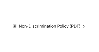
PDF
If a link will open or download a PDF, add “(PDF)” at the end of the link text. This tells users that a file will be available upon interacting with the link.
A PDF link should also have a “PDF” icon superseding the link text.
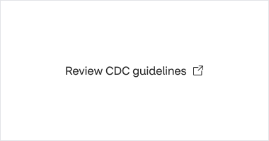
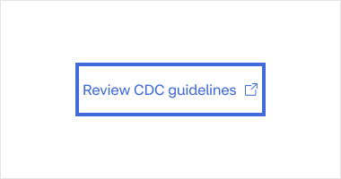
New tab or external page
A link that opens a page in a new tab, whether it be an external link or not, should include a trailing, “new tab” icon.
The “new tab” icon always includes the accessible text “new tab”.

Secure page
Link text should indicate if users will be taken to a secure section within the site.
Choosing the right link style

When next to or underneath paragraph text, use standalone link in strong weight to provide distinction.

The link style should not have the same weight as any adjacent text, unless the adjacent text is another link.
Color contrast
Make sure that all links have at least 4.5:1 contrast with the page background. Use default and strong links on light backgrounds. Use high-contrast and reverse links when page backgrounds don’t meet contrast standards with default or emphasized links.


Using a reverse link on a dark background ensures that the link has a contrast ratio of at least 4.5:1 against the background.


Poor contrast makes it difficult to read this standard link. Use a reverse link instead.
Content Strategy
Don’t use punctuation for standalone and CTA links. Inline links can include punctuation if they are at the end of a sentence.
Use sentence case
6 words max
Be specific
Links must be clear and predictable so users know what will happen when they click it

Links should be clear and concise.

Long link text is difficult to comprehend. Inline links should not take up an entire sentence or paragraph, keep it concise.


Tell users where a link will take them, so that the link is clear without context.


Avoid writing “Click here” or “Link” in link text.
Users who visually scan a page will be able to identify links. Users of assistive technology will also know when they encounter a link, given that it is properly coded and visually designed.


Avoid writing out URLs in link text. Instead, give the link a meaningful text label.
Secure page
Link text should indicate if users will be taken to a secure section within the site.
TTY for phone numbers
CVS adds TTY numbers after phone numbers. This ensures that TTY (text telephone) users can access our services.
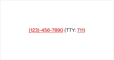

Both the phone number and the TTY number should be linked.
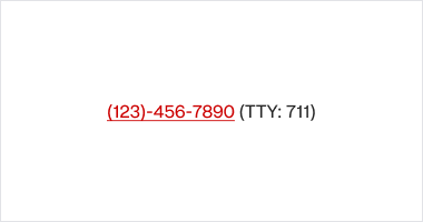

If the phone number is linked, the TTY number should also be linked.
Behavior
States
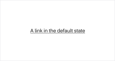
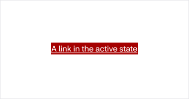
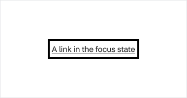
These images illustrate the inline default link states. Other link states are different.
Default
Hover
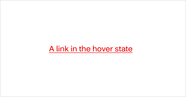
The underline thickens in the hover and active states. This behavior is not currently available in Figma but must be coded into the component.
Active
Focus
Visited

Icons
An icon associated with link text is also part of the link’s interactive area.
Text reflow: CTA, Standalone CTA, and Standalone Links
If link text exceeds the width of its container, the text will wrap to the next line. In Figma or Sketch, you can resize the container or press the return key to create a new line of text.
Don’t truncate link text.
Orphan words (words at the end of a phrase that are left dangling on a new line) may appear in some cases due to variations in text size, browser, screen size, and other factors. Don’t be concerned with eliminating these.